I design products
people actually
want to use.
Designing digital products that are clear, useful, and worth using. Based in Cairo, open to roles across MENA and remote.
Selected work
3 projectsGood UX is specific.
Generic is the enemy.
I'm Marium — a product designer based in Cairo. I studied Business Informatics at the German University in Cairo and have spent the past three years designing end-to-end product experiences — from lending flows and onboarding to loyalty systems, savings, and design systems.
What I care about: interfaces that don't make people think twice. Research before pixels. Design decisions backed by data, not instinct alone. Products that feel obvious in hindsight — because the hard thinking happened before the first frame was opened.
Outside of work I'm usually thinking about consumer audio, skincare, or whatever's on my desk.
Fintech super-app · Cairo
Remote · Relocation
Letting you in.
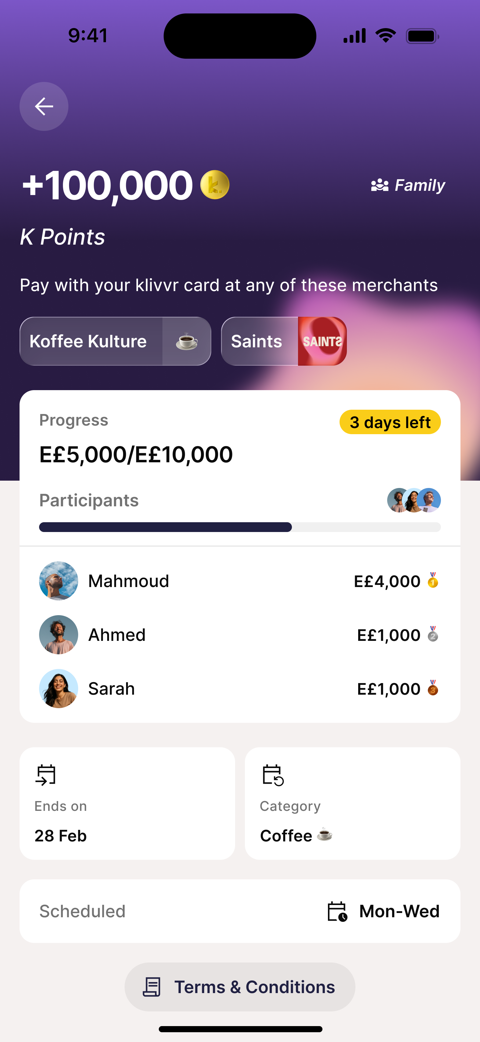
End-to-end redesign of K-Points — the loyalty program inside a Cairo-based fintech super-app — from a buried, passive points tracker into a full loyalty ecosystem built around habit formation, tier progression, and partner rewards. Six months from kickoff to ship. Two major iterations. Five months of live data validating the bet.
I design for users who are underserved by the products meant to serve them. K-Points was a clear example.
I've spent the past few years designing across lending, savings, and rewards surfaces for users who care deeply about their finances — people tracking every transaction, monitoring loans, and looking for ways to make their money work harder. What I kept seeing: loyalty features built by teams who understood the business logic but not the user psychology. Points as a receipt, not a relationship. Tiers as backend metadata, not a visible identity. Redemption as an afterthought, not a moment.
The original K-Points system had ambition but no visibility. A loyalty program users don't know they have isn't a loyalty program — it's dead weight on the balance sheet.
The short answer — users weren't getting what they deserved.
Before designing anything, I ran discovery across three research streams: user interviews, Amplitude session data, and support ticket analysis. The findings converged on three failure points — and two core problems.
I narrowed this down to two core problems.
Invisibility.
The balance, the tiers, and the redemption paths were all technically present — but none of them were surfaced in a way that made users feel the system was working for them. Points felt abstract. Tiers felt irrelevant. Redemption felt complicated. Loyalty infrastructure with no loyalty experience built on top of it.
One-size-fits-all redemption.
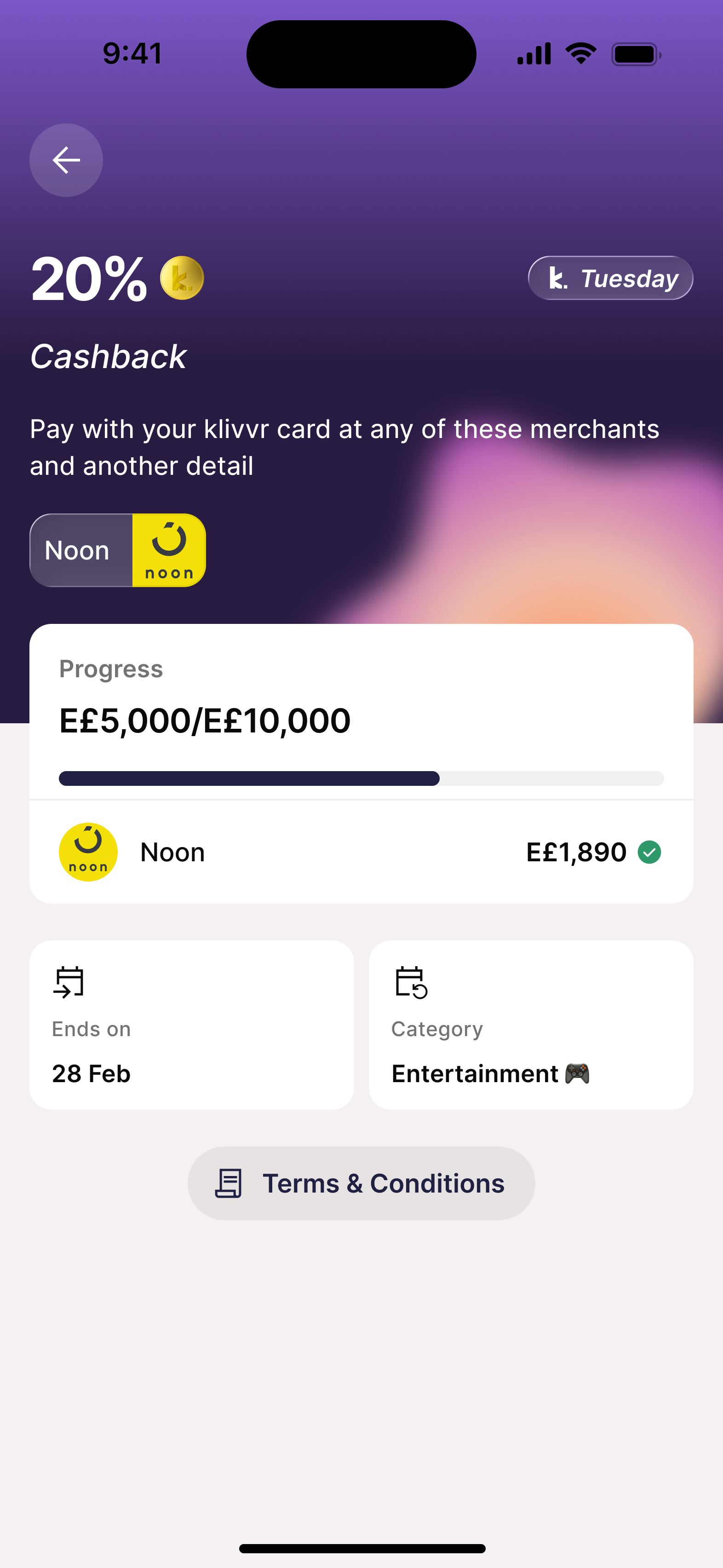
Cashback was the only redemption path. It worked for impulse redeemers but not for users saving toward something meaningful. High-intent users — the ones who transact most and spend most per session — had no path that matched their appetite. And from a business perspective, cashback is a direct cost: every redemption is a margin hit. Merchant vouchers and partner redemptions flip that equation — each redemption becomes a revenue-share event, driving spend at partners instead of reducing margin. The product was underserving its best users and leaving commercial value on the table.
Four types of users. One system to serve them all.
Research surfaced four distinct mental models — each engaging with loyalty for a different reason, and each breaking the existing system in a different way. The redesign had to work for all of them.
Uses the app for daily essentials. Transacts frequently but never explores beyond core payments.
Quick cashback. Points into money, no learning curve.
Four-screen redemption. Dropped off every time before confirming.
Cashback in 3 taps. Live conversion rate visible before committing.
High transaction volume. Status-conscious — wants recognition that the app sees her differently.
Visible tier, exclusive perks, recognition of her loyalty.
Tiers existed but were invisible. Platinum behavior, Bronze experience.
Tier badge, progress bar to Platinum, tier-exclusive rates surfaced upfront.
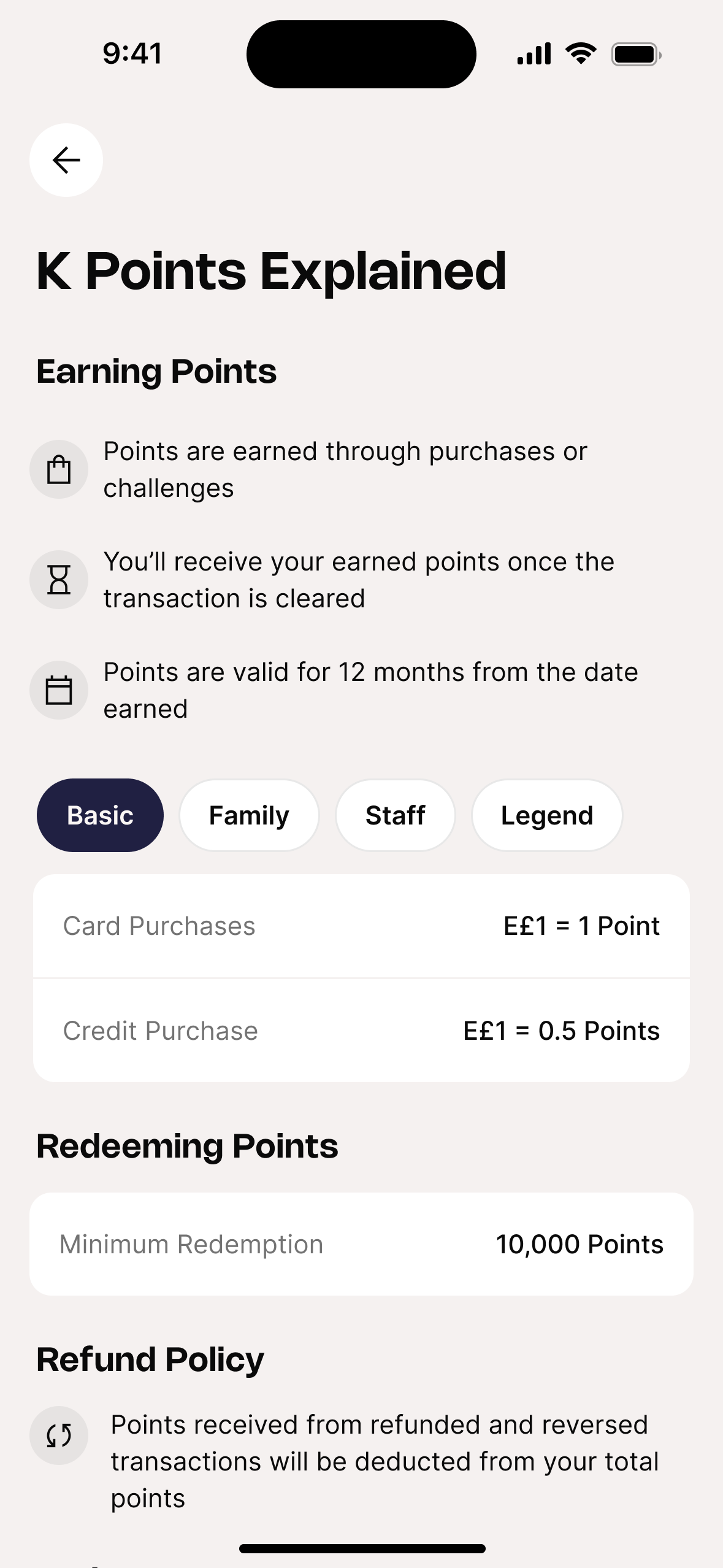
Primary use case is buy-now-pay-later. Earns at a different rate (E£1 = 0.5 Points). Motivated by financial tools, not rewards.
Understand exactly how his plan type affects his earn rate.
No education layer. Earn rates buried in T&Cs.
K Points Explained screen with plan-segmented earn rates behind a tab switcher.
Manages spending for a household of four. Thinks in family value, not individual reward.
Vouchers — higher value per point, worth saving toward.
No voucher system. Cashback only — too small for household-scale spending.
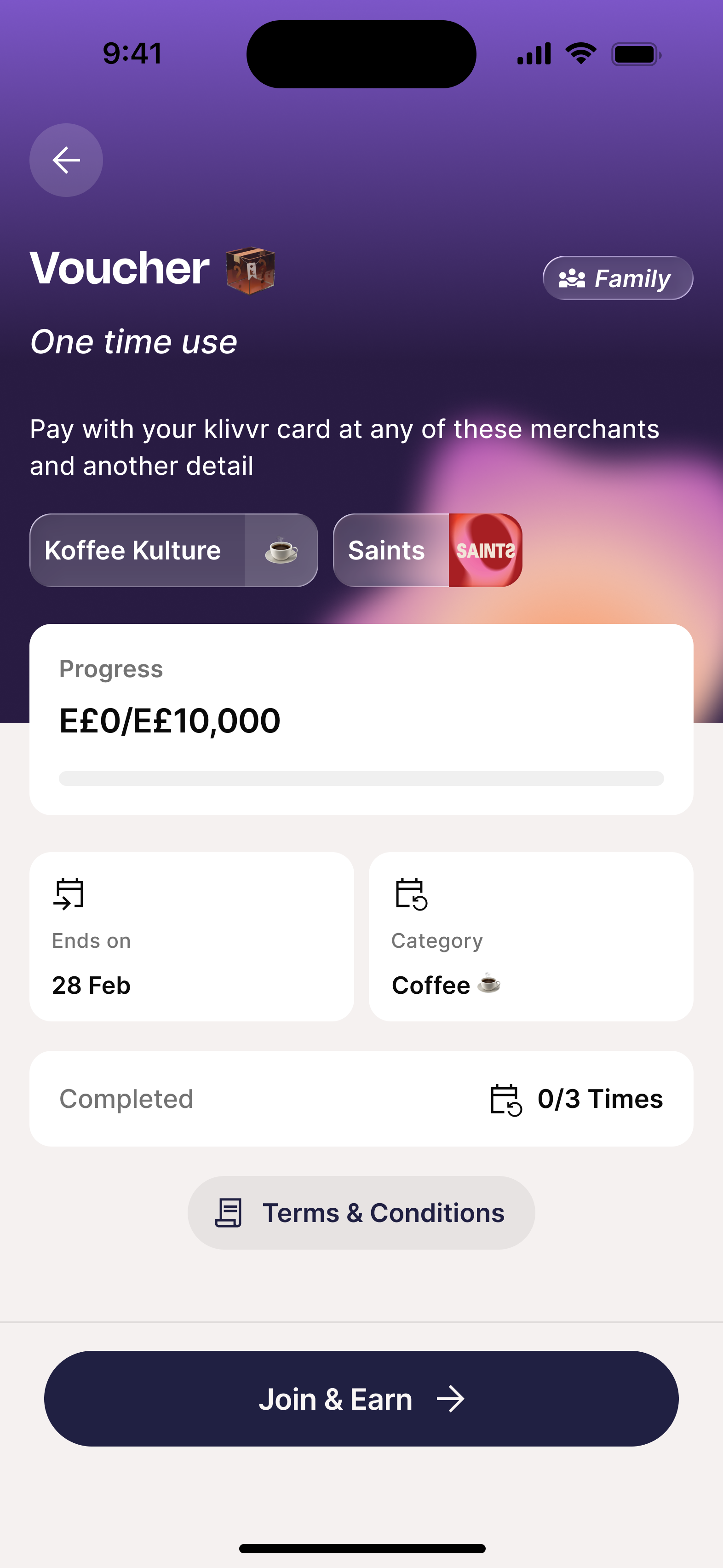
Voucher ecosystem, E£100–E£1,000 denominations, higher value per point at every tier.
How each persona actually uses the system.
Personas tell you who someone is. Scenarios tell you where the design breaks. Three critical journey moments — the exact places where the old K-Points lost people.
Notification taps to home screen. No loyalty entry point. He searches for 2 minutes, gives up.
Deep-links to loyalty hub. Balance is the hero. Progress bar shows the path. One tap to Redeem.
Moved to Gold silently. No feedback. She had no idea her redemption rate improved.
Gold badge, rate comparison, progress bar already counting toward Platinum with a deadline.
No voucher system. Cashback only — significantly less value for household-scale spending.
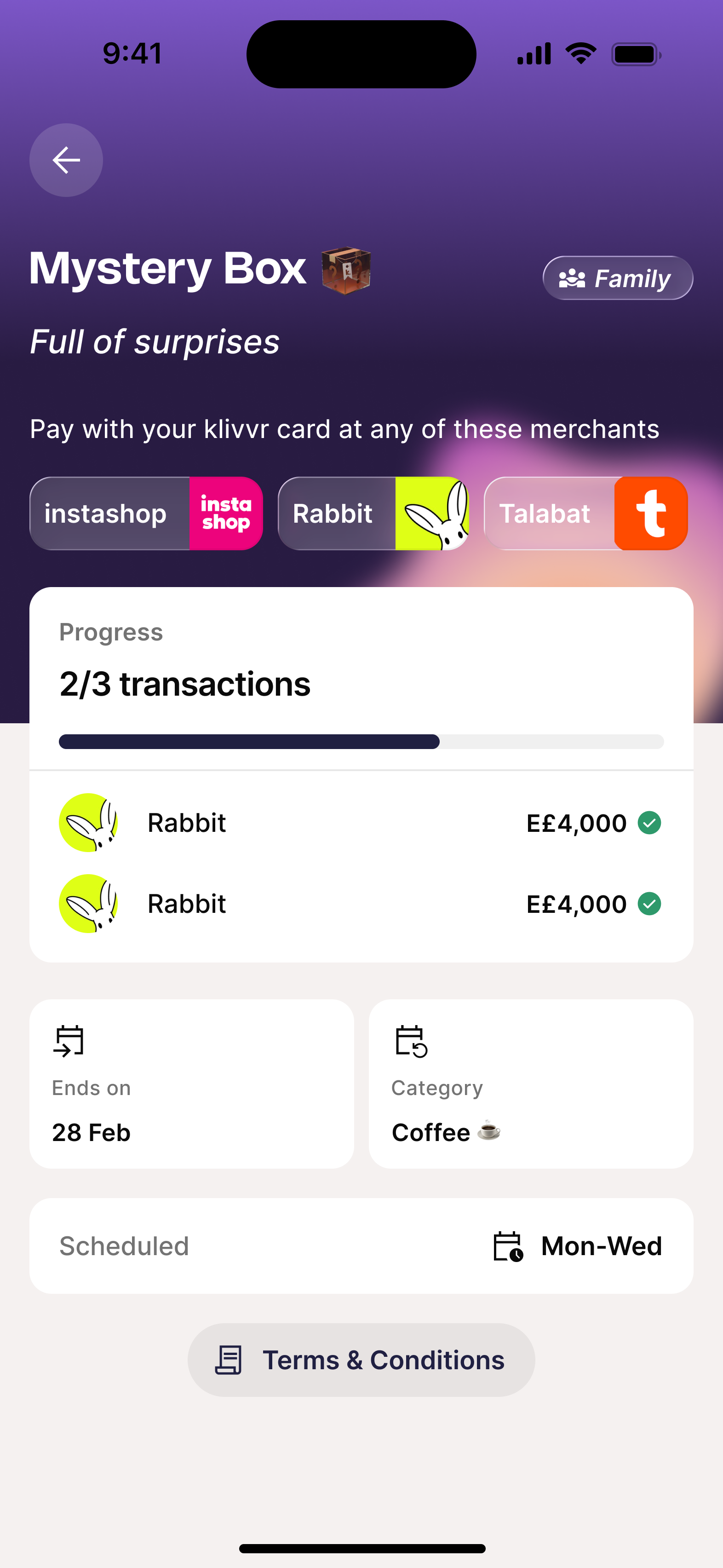
Four denominations per merchant. Slide-to-confirm. Code instant. 1,000+ redeemed in 5 months.
If earning feels effortless and redemption feels genuinely valuable — user behavior will change.
More spend. More frequency. More engagement. Give users a real reason to keep coming back, and the numbers will follow. It took six months to build, two major iterations to get right, and five months of live data to test whether the idea held up in reality.
Make the value impossible to miss.
Balance as hero. Tier as identity. Progress bar that tells the user exactly where they stand. If a user has to look for their points, the product has already failed.
Make redemption worth earning toward.
Cashback for immediacy. Vouchers for aspiration. Two paths, two mental models. The right option at the right moment turns a passive earner into an active participant.
Make progression feel active, not passive.
Linking challenges to tier advancement gave users a reason to open the app before a transaction, not just after. Specific goals outperform passive accumulation every time.
Here's what we built.
A loyalty ecosystem where every interaction with the product compounds into tangible value — across four tiers, two redemption paths, and a partner voucher catalog built around real user behavior.
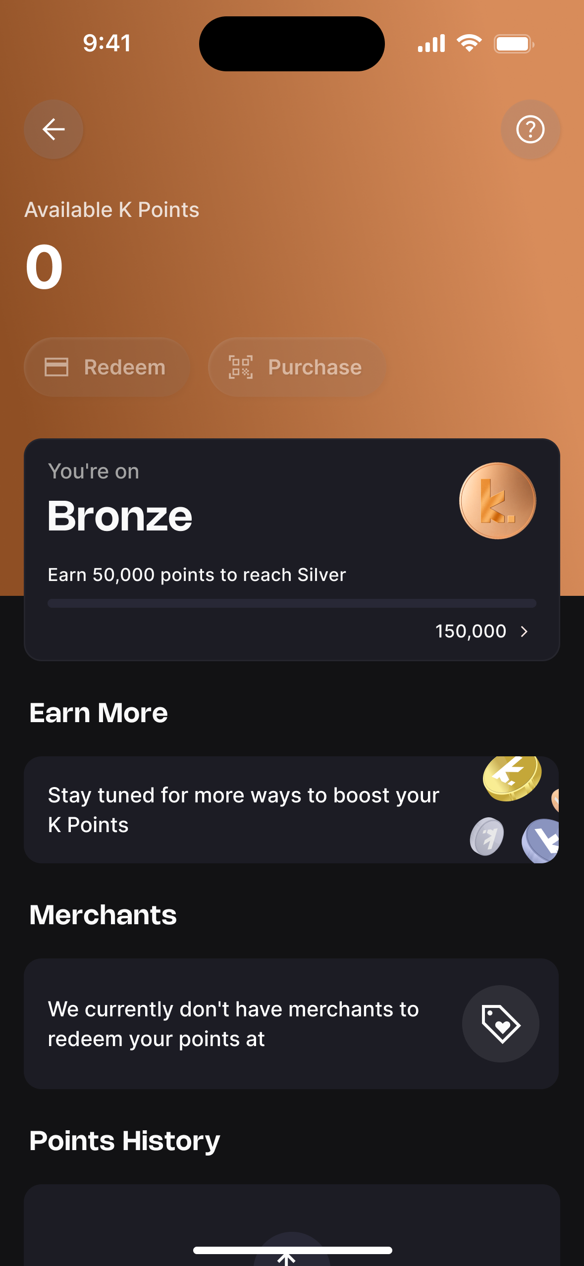
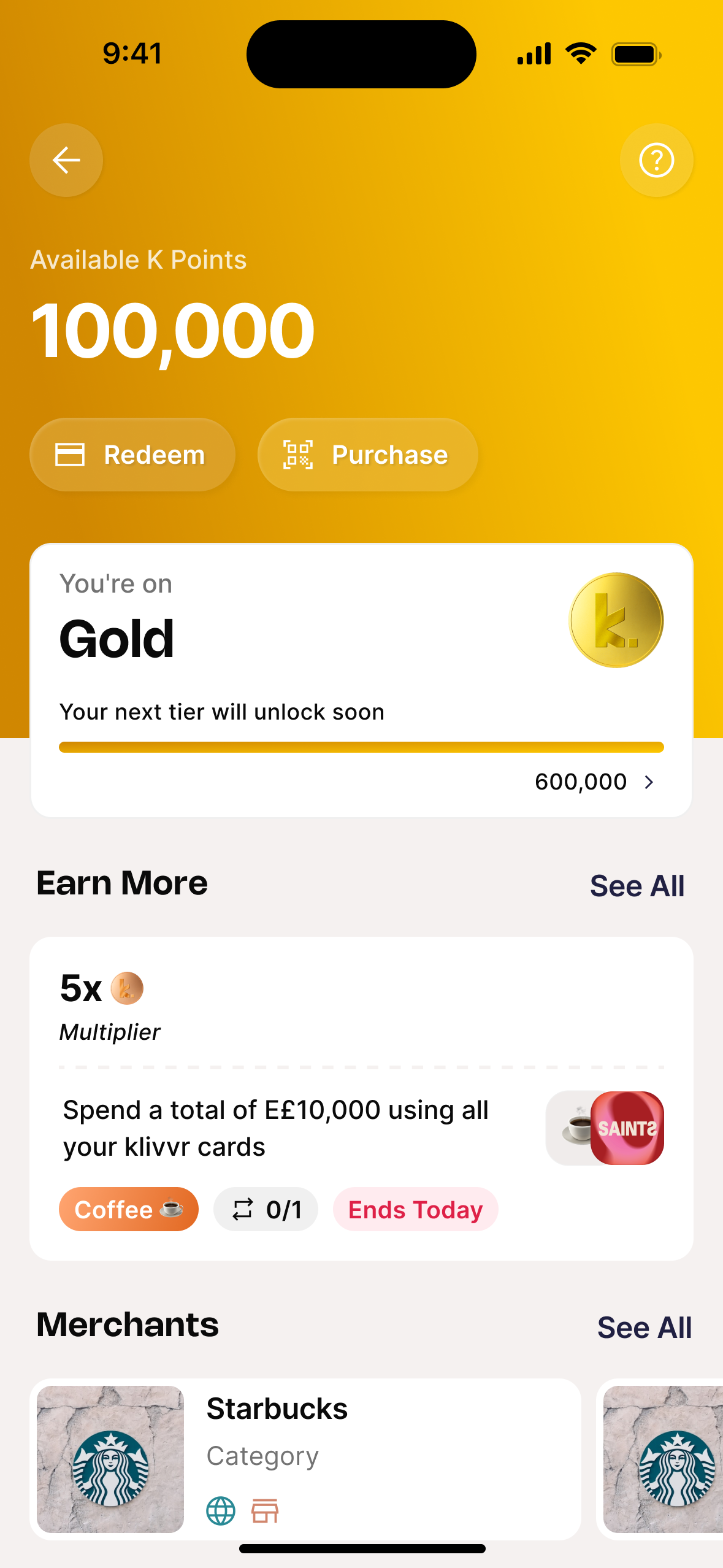
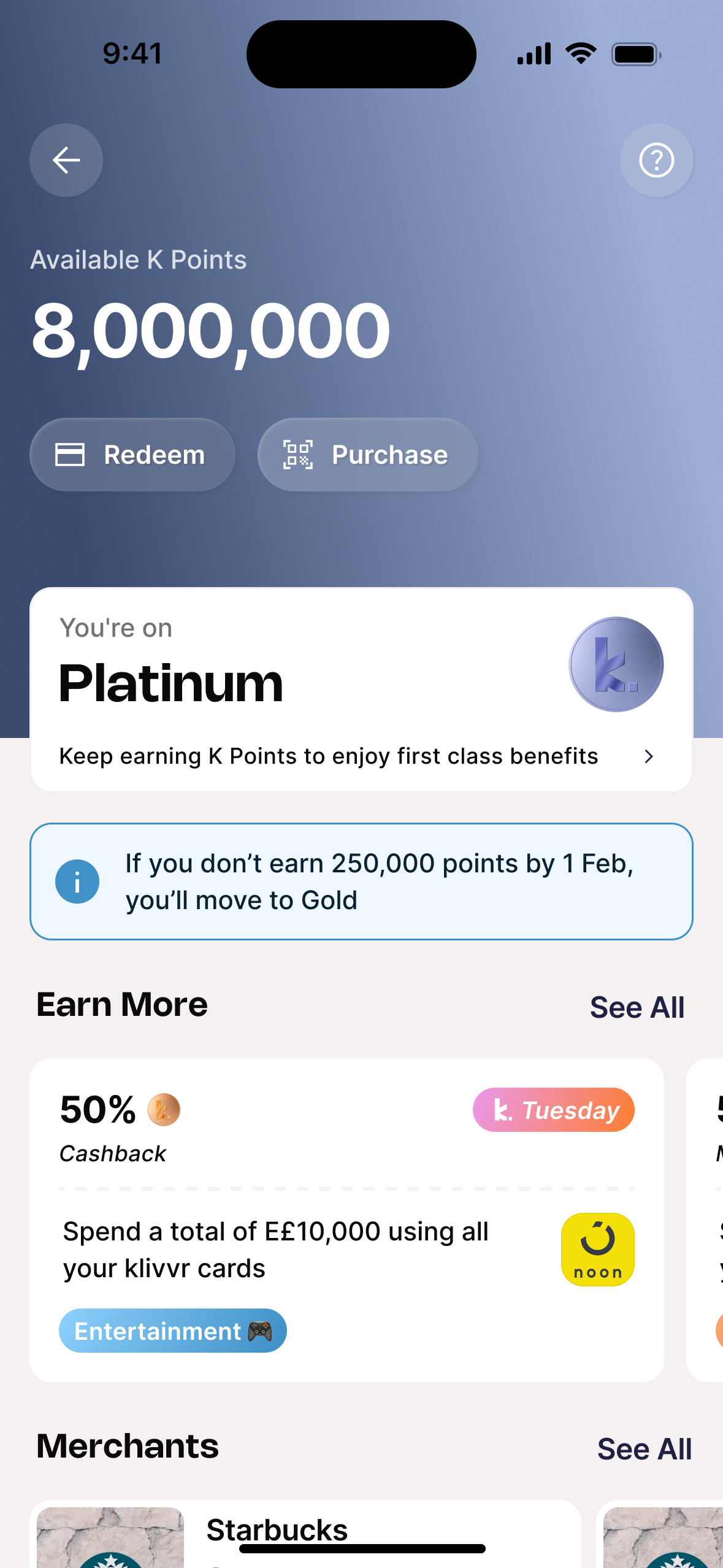
Four tiers. Each one visually distinct by design.
Bronze, Silver, Gold, Platinum — each with its own color identity so the upgrade moment is immediately recognizable without reading a word. The balance, tier badge, progress bar, and earn rate all update simultaneously.
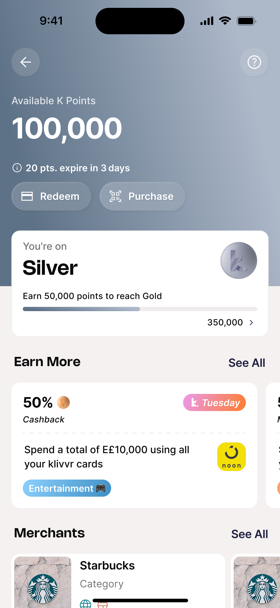
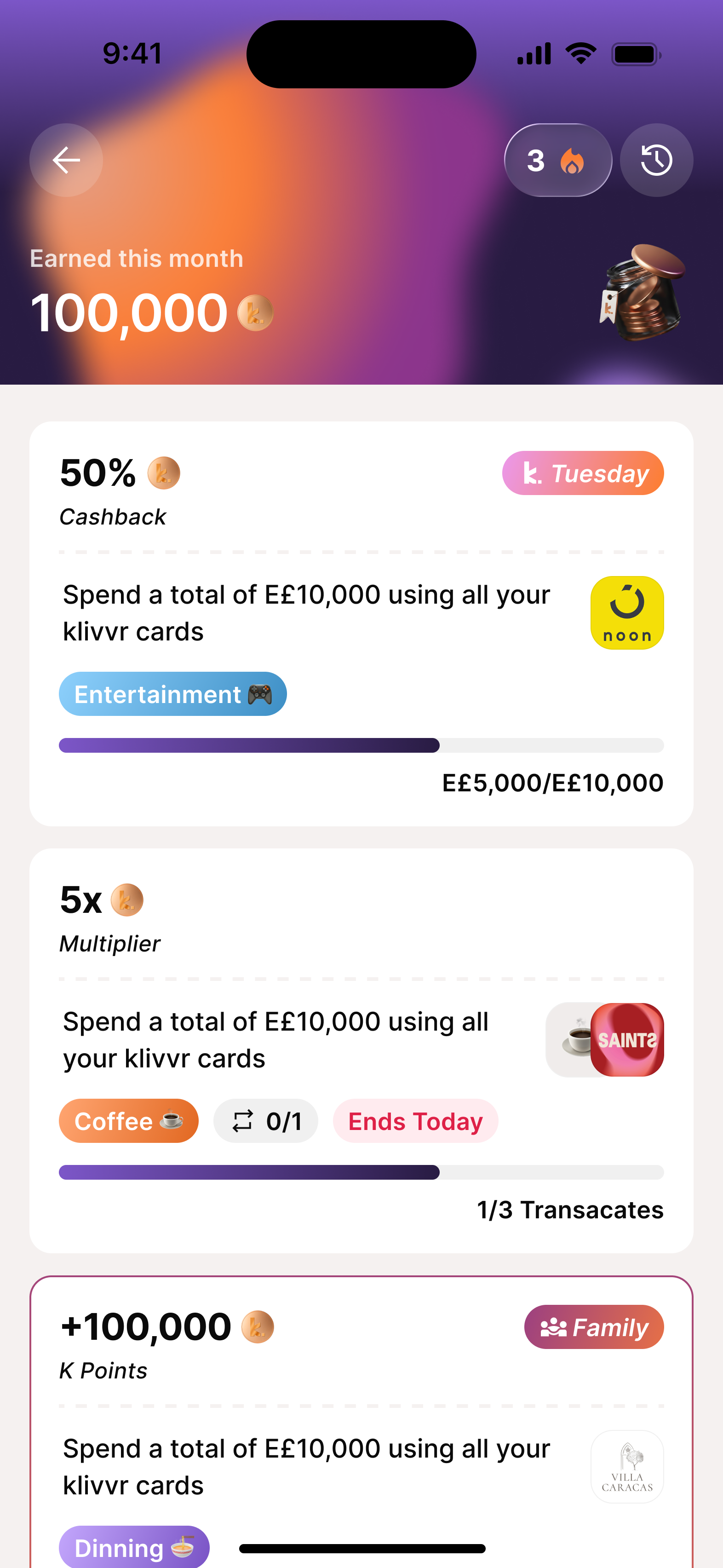
Your points, always in view.
The balance moved out of the sub-menu and into the loyalty hub as the hero element. Below it: the tier card, an earning hint, and a scroll of "Earn More" challenges — concrete actions to move the number up this week.
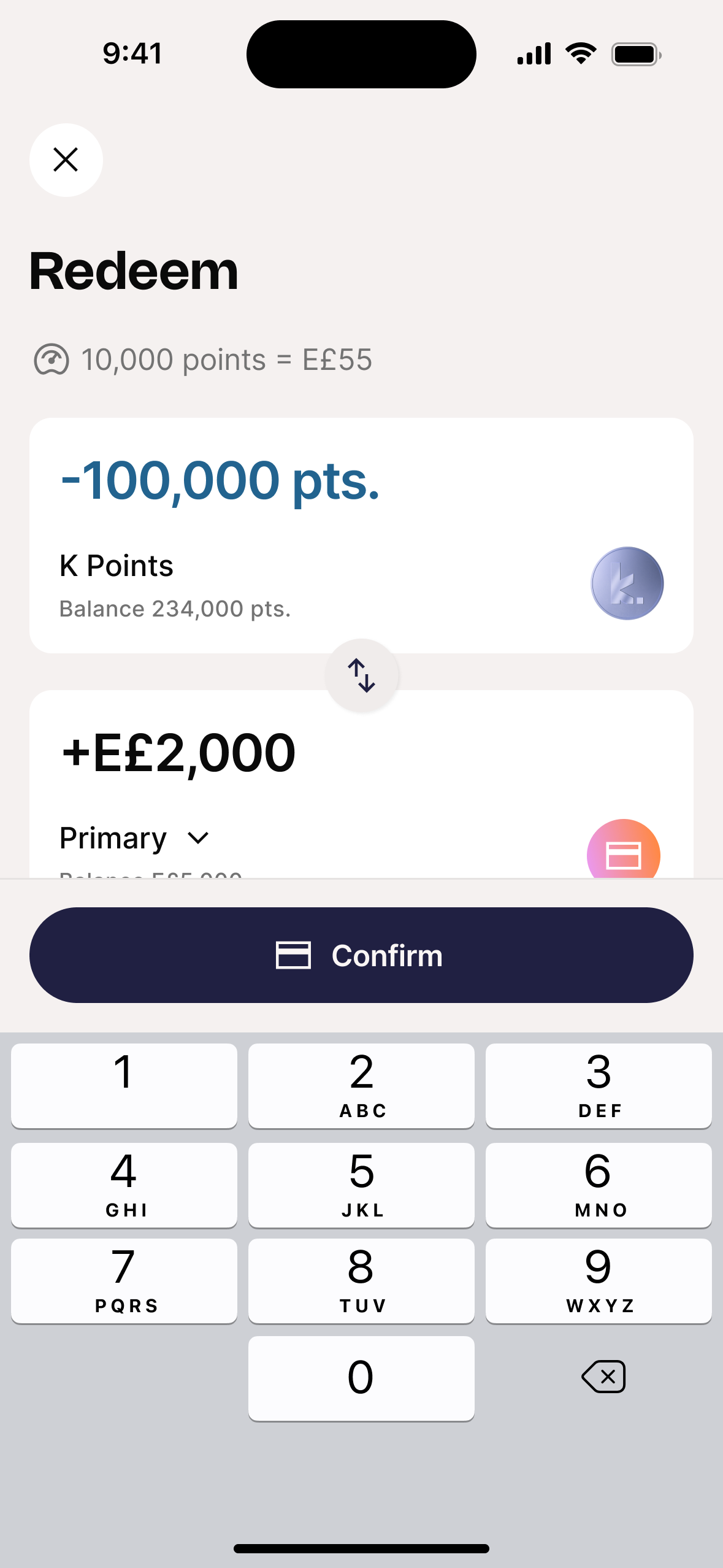
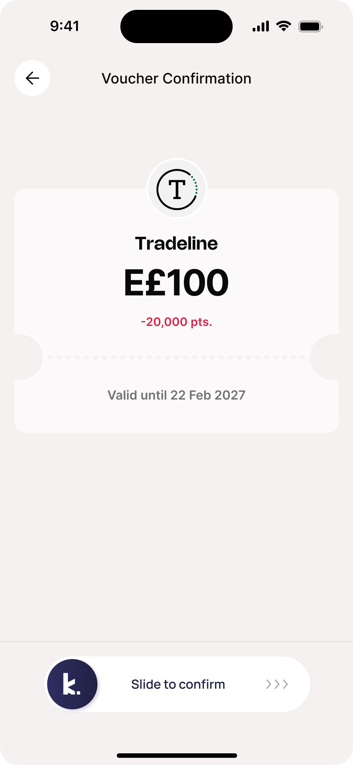
Redemption in three taps.
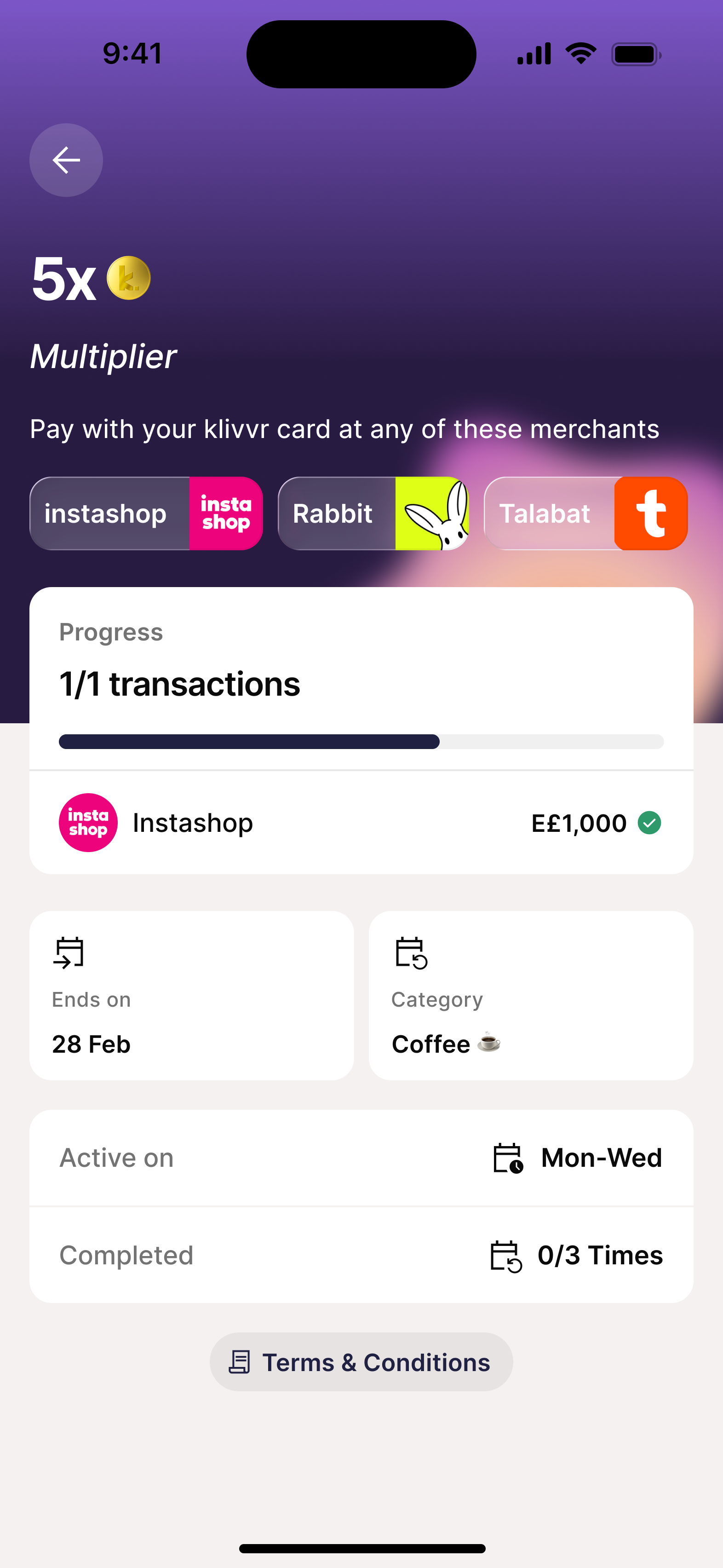
Two paths — Cashback or Partner Vouchers — with live conversion rates visible at every step. No surprises at confirmation. Cashback achieved a 12.7% conversion rate, the highest of any loyalty action in the app.
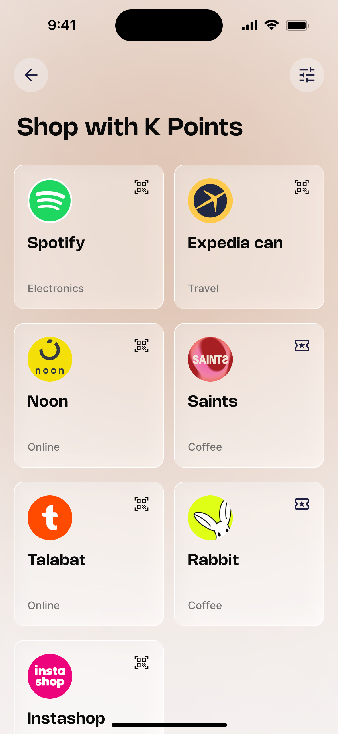
Partner rewards, surfaced.
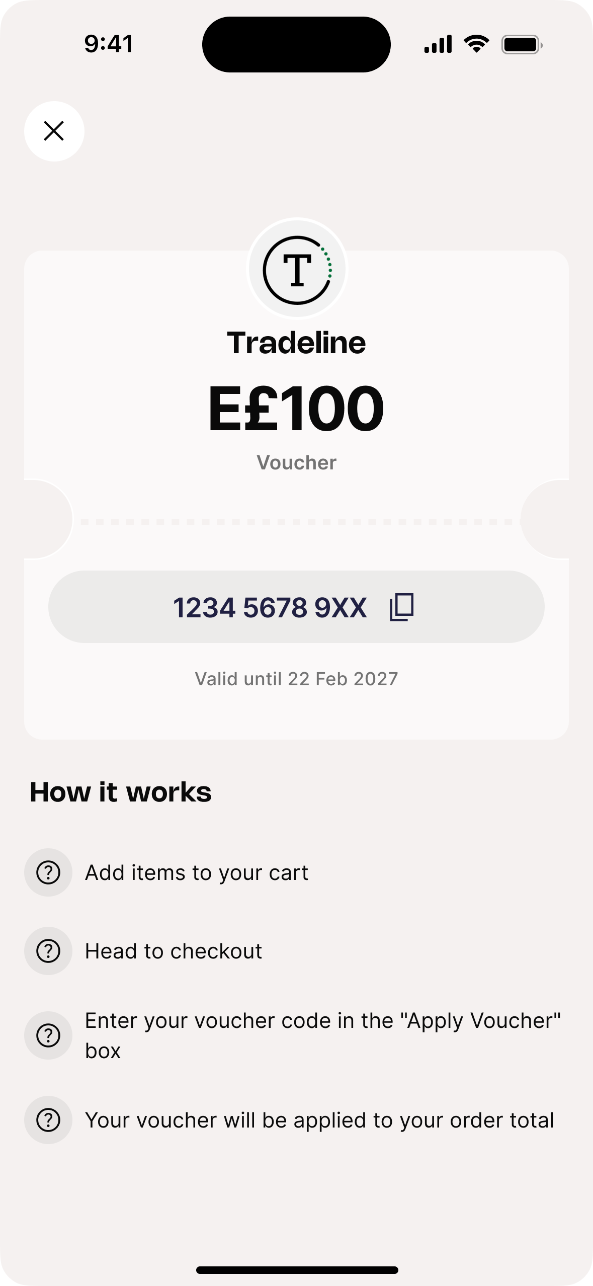
Vouchers as a first-class destination — four denominations per merchant, slide-to-confirm that matches the gravity of a non-refundable action, and one-tap code copy with step-by-step redemption instructions built in.
Three decisions that shaped the final product.
Each one came from a constraint, a data signal, or a live test result — not from a brief.
The initial launch: Cashback only. No merchants, no vouchers.
The first version launched with the core loyalty engine: visible balance, four-tier progression, and cashback-only redemption. The hypothesis was that getting the foundation right first would drive enough initial engagement before expanding the catalog.
Cashback drove 12.7% conversion — strong for a first release. But users were hitting the redemption screen, seeing one option, and leaving. Power users and family plan users needed a higher-value alternative that cashback couldn't deliver.
The insight: A single redemption path is a ceiling, not a foundation. The data justified the redesign.
The redesign: The partner constraint that became a better product.
Merchants couldn't integrate with a QR-based redemption portal — too much technical lift, timelines didn't match. The original merchant flow was dead on arrival for most partners. We had to design around it, not through it.
A fully product-managed voucher lifecycle — bulk ingestion, inventory, redemption, fulfillment all internal. Zero integration for merchants. Within five months: 1,000+ vouchers redeemed, cashback redemptions dropped 16% as users migrated to higher-value paths.
The insight: Partner constraints aren't blockers — they're product inputs. What started as a workaround became the most scalable part of the ecosystem.
Linking challenges to loyalty as a tier accelerator.
After the redesign launched, Amplitude data showed tier progression was still mostly passive. Users earned through regular transactions but weren't actively trying to reach the next tier. The gap between Silver and Gold felt abstract, not achievable.
We linked Challenges & Rewards directly to K-Points earning. Completing a challenge didn't just give a reward — it accelerated progress toward the next tier. Specific, time-bound goals gave users a reason to open the app before spending, not just after.
The result: April — 24 campaigns, +57% participation. May — 35 campaigns, +42% participation. Challenge completion became the fastest path to tier advancement and the strongest engagement signal in the entire dataset.
The early data is encouraging.
Five months of live data doesn't prove success — but it provides confidence we're moving in the right direction. Every number below represents actual behavior change across the product's active user base.
What I'd do differently.
I'd build the challenges layer before the tier system, not after. The data shows specific, time-bound goals drive engagement more powerfully than passive progression. If we'd led with challenges in the initial launch, the engagement curve would have been steeper from day one. The tier system is the foundation — but challenges are the engine.
On partner constraints as design inputs.
The voucher pivot was the most important decision of the project — and it came from a constraint, not a brief. Merchants couldn't integrate technically. Instead of treating that as a blocker, we designed around it and built something more scalable than the original plan. Constraints tell you where the real product lives.
Loyalty is a long game.
Five months provides confidence, not proof. We're seeing growth in spend, stronger engagement patterns, increasing challenge participation, and users exploring more valuable redemption journeys. The real test is whether the behaviors we're creating today translate into measurable retention twelve months from now.
What's next.
The next version layers in the full gamification system — spin wheel, streak tracking, mystery boxes — now that the trust foundation is in place. The challenges system is the bridge, and the data already shows it's working.
Letting you in.
The Challenges feature had a brutal funnel problem: 29,411 monthly viewers, only 180 joiners — a 0.6% conversion rate. I led the redesign end-to-end — introducing a K-Points jar, streak mechanics, family challenges, and a personal dashboard — to turn a high-traffic dead end into an engagement engine.
29,000 users walked in. 180 stayed.
Amplitude data told a clear story: the Challenges screen had strong top-of-funnel traffic but was losing users at every step. Most who viewed never tapped a card. Most who tapped never hit Join. Against EGP 75M in monthly transaction volume, every month of delay was wasted opportunity.
I narrowed it down to two core problems.
Before touching Figma I annotated the existing screen with five specific UX failures. Everything traced back to two root causes.
No reason to act.
No progress bar. No urgency. No deadline. No reward framing. Merchant logos tiny and grey. Users arrived at the detail screen and had nothing compelling enough to overcome the inertia of "I'll come back to this later." They never came back.
No reason to return.
Between challenges, there was nothing. No running total. No jar filling up. No streak to protect. No monthly rhythm. The screen only mattered when users remembered it existed — which wasn't often enough.
No progress bar.
Day 1 looked identical to day 6. No visual fill, no momentum, no reason to feel invested in continuing.
No urgency on cards.
Reward shown, ratio shown (0/3), but no end date, no deadline chip, nothing that said "do this today."
Tiny merchant branding.
Logos were small circles, names in grey. Talabat, Noon, Instashop — brands users recognise — weren't doing any work.
No reward context.
"10,000 K-Points" with no EGP value, no comparison, no framing of why it's worth completing.
Upcoming tab built nothing.
Tab existed but offered no preview of what was coming or when. A destination with nothing to see.
% of users who view the Challenges screen and successfully join at least one challenge.
The 0.6% baseline wasn't a content problem — it was a design problem. Users weren't finding reasons to act in the moment. The redesign had three jobs: make the reward obvious, make progress tangible, and give users a reason to return daily.
Make the reward impossible to miss.
Reward value as the hero element on every card and detail screen. The number first — everything else is context.
Add urgency without adding noise.
Urgency chips (🔴 ≤2 days, 🟠 ≤4 days), end dates visible on cards, scheduling windows — honest time pressure.
Give users a reason to return daily.
The K-Points jar, streak system, and monthly reset create a daily loop independent of whether a challenge is available.
Here's what we built.
A complete redesign — from the landing page and challenge types through streaks, family challenges, a personal dashboard, and the K-Points jar that ties everything together.
The landing page — a status dashboard, not a list.
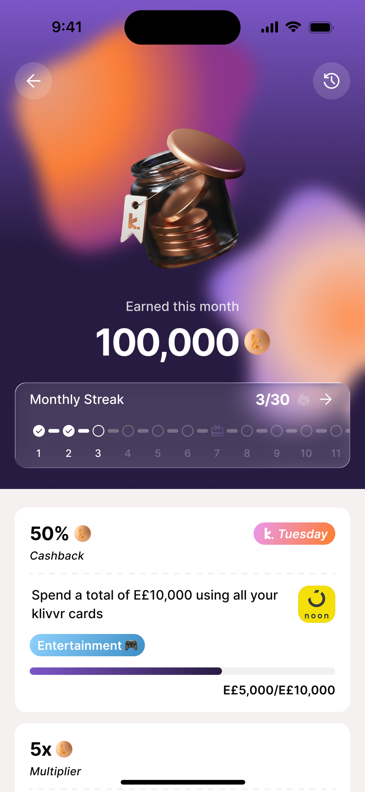
The new landing page opens with a hero section: the K-Points jar (filling as you earn), your monthly total, active streak count, and a ranked challenge list below. Users arrive with an immediate sense of where they stand before they see a single card. Empty state designed too — "Curating Challenges..." gives the screen purpose even before content loads.
Three challenge types. Each one designed differently.
Cashback, Multiplier, and Voucher challenges — each with a distinct visual treatment on the card and detail screen. Prominent merchant branding, visible progress bar, urgency chip, scheduling window, category tag, and a Join CTA that disappears after joining (replaced by an "Active" badge).
Progress that shows exactly what counts.
The detail screen lists every qualifying transaction with merchant, amount, and a green checkmark. Users know exactly where they stand and exactly what their next transaction needs to do. Family challenges show each member's contribution with individual progress bars and a combined total.
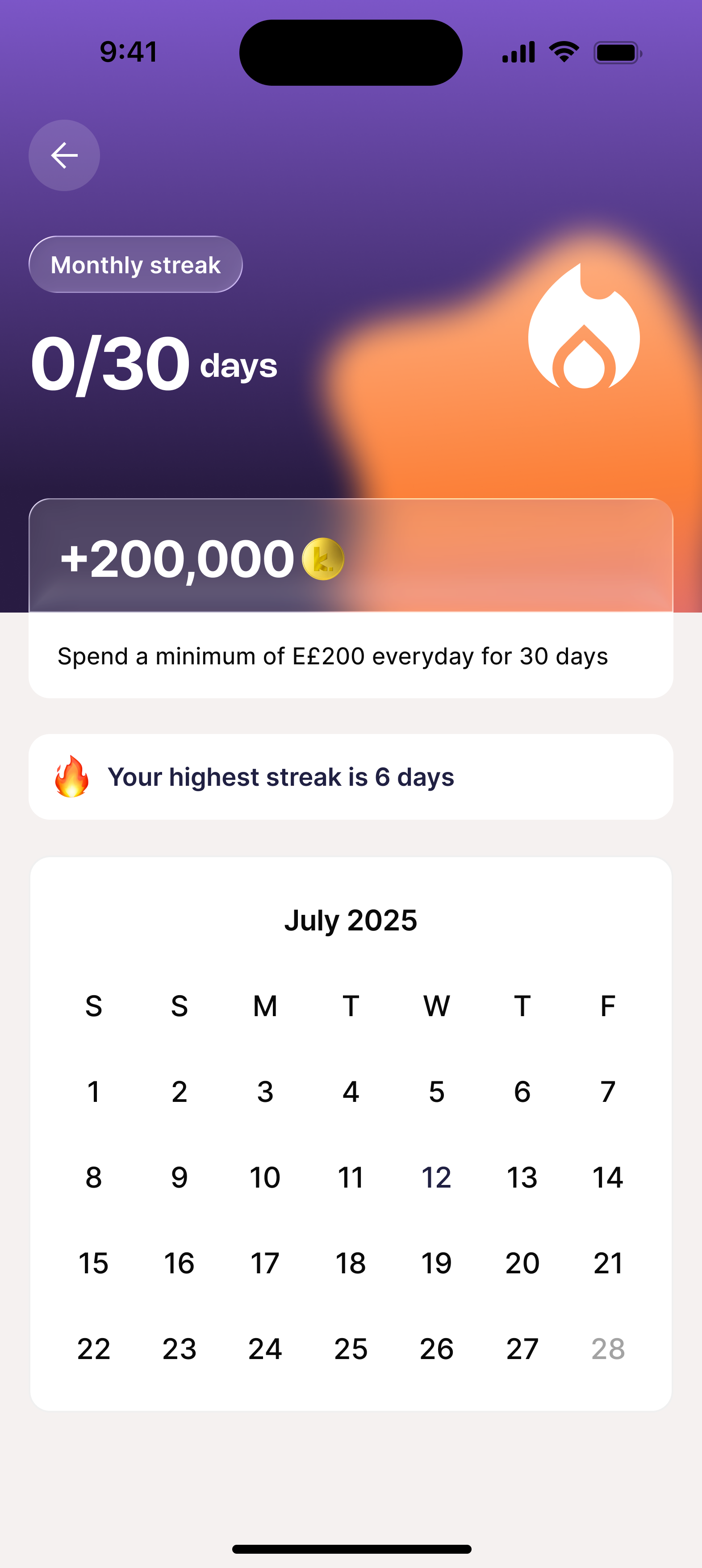
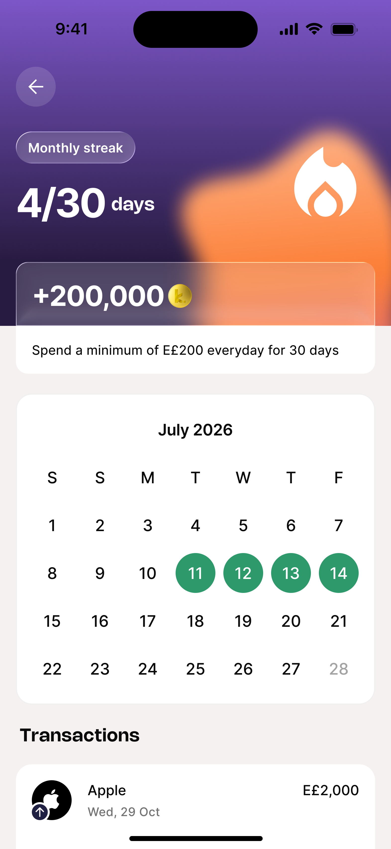
Streaks — the daily engagement loop.
Monthly streak: spend E£200 every day for 30 days, earn 200,000 K-Points. Calendar view shows completed days in green. Two states — empty (0/30) and active (4/30) — with the highest streak shown as a benchmark and loss-aversion messaging when at risk.
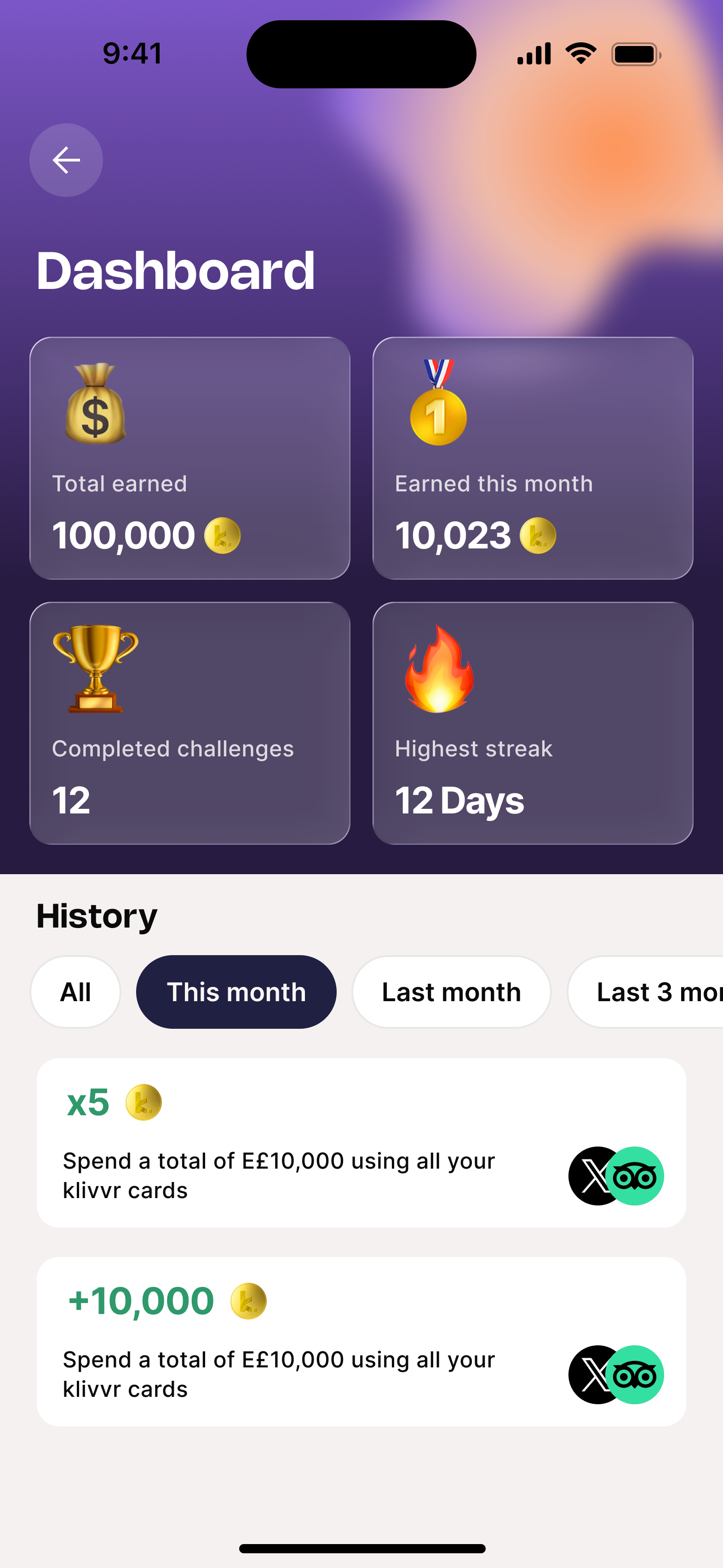
Personal dashboard — your challenge story.
Total K-Points earned (lifetime + this month), challenges completed, and a filterable transaction log linked to the challenge each transaction contributed to. Turns activity into a sense of cumulative progress — not just the current challenge.
Three decisions that shaped the redesign.
Redesign the detail screen first — not the landing page.
29.1% of users tapped a card — reasonably strong. But 97.9% of those dropped off before tapping Join. The problem wasn't the list. It was the detail screen. Users arrived, looked, and left.
Detail screen redesign as Phase 1's highest-leverage intervention. Reward as the most visually prominent element. Join CTA above the fold on all screen sizes. Progress states, scheduling windows, completion counts — all the information causing hesitation, surfaced.
The insight: A 97.9% drop-off from card tap to join tap means the problem isn't discoverability — it's conversion. Fix the detail screen before anything else.
The K-Points jar as the monthly engagement anchor.
Users had no reason to open the tab on days when they weren't actively in a challenge. The screen was only a destination for joining — not for checking in. Without a persistent hook it only mattered when users remembered it existed.
A 3D animated jar filling as users earn K-Points, with four tier thresholds (Bronze 0–600K → Platinum 4M+) and a monthly reset delivering a tier reward. The jar makes monthly progress tangible and gives a reason to check in even between challenges.
The insight: The best engagement mechanic rewards checking in — not just completing. The jar creates value from the act of opening the screen, independent of whether a challenge is available.
Family challenges as a shared progression surface.
Family plan users were already the highest-value segment — transacting more, spending more, retaining better. But the Challenges experience was entirely individual. A family of four spending collectively had no way to pool that activity toward a shared reward.
A family challenge variant showing each member's individual contribution, a combined progress bar, participant avatars, and a shared reward. The urgency chip creates household-level urgency — one member can nudge others before the deadline. Loyalty becomes a group activity.
The insight: Social accountability is a more powerful retention lever than individual incentives. When a family member's inactivity affects everyone's reward, engagement becomes a shared responsibility.
What we're building toward.
This project is in progress. Targets set at kickoff, tracked in Amplitude post-launch.
On designing before the data is in.
This project is in progress — the post-launch numbers don't exist yet. But the Amplitude funnel at the start was unambiguous enough to make high-confidence decisions. A 97.9% drop-off told me exactly where to focus before I opened Figma.
On the jar as a design decision, not a feature request.
The jar wasn't in the original brief — it emerged from asking why users had no reason to open the tab between challenges. Sometimes the most important design decisions come from asking "what's missing" rather than "what was asked for."
What I'm watching post-launch.
The conversion rate from detail screen to join tap is the number I care most about. If the redesign works, that 2.1% should move significantly. The jar and streak data will tell us whether the daily loop is working. Family challenge completion will tell us whether social accountability is actually the stronger lever.
Letting you in.
End-to-end design of a consumer lending product inside a Cairo-based fintech super-app — built from zero, no prior version to inherit. I owned both the LOS (origination — how users apply for and receive a credit limit) and the LMS (management — how they use, repay, and manage that credit day to day). Loan origination, installment tracking, early settlement, closed-loop QR, autopay. Sole designer across 12+ months. Now live, with active users.
Four mental models, one product.
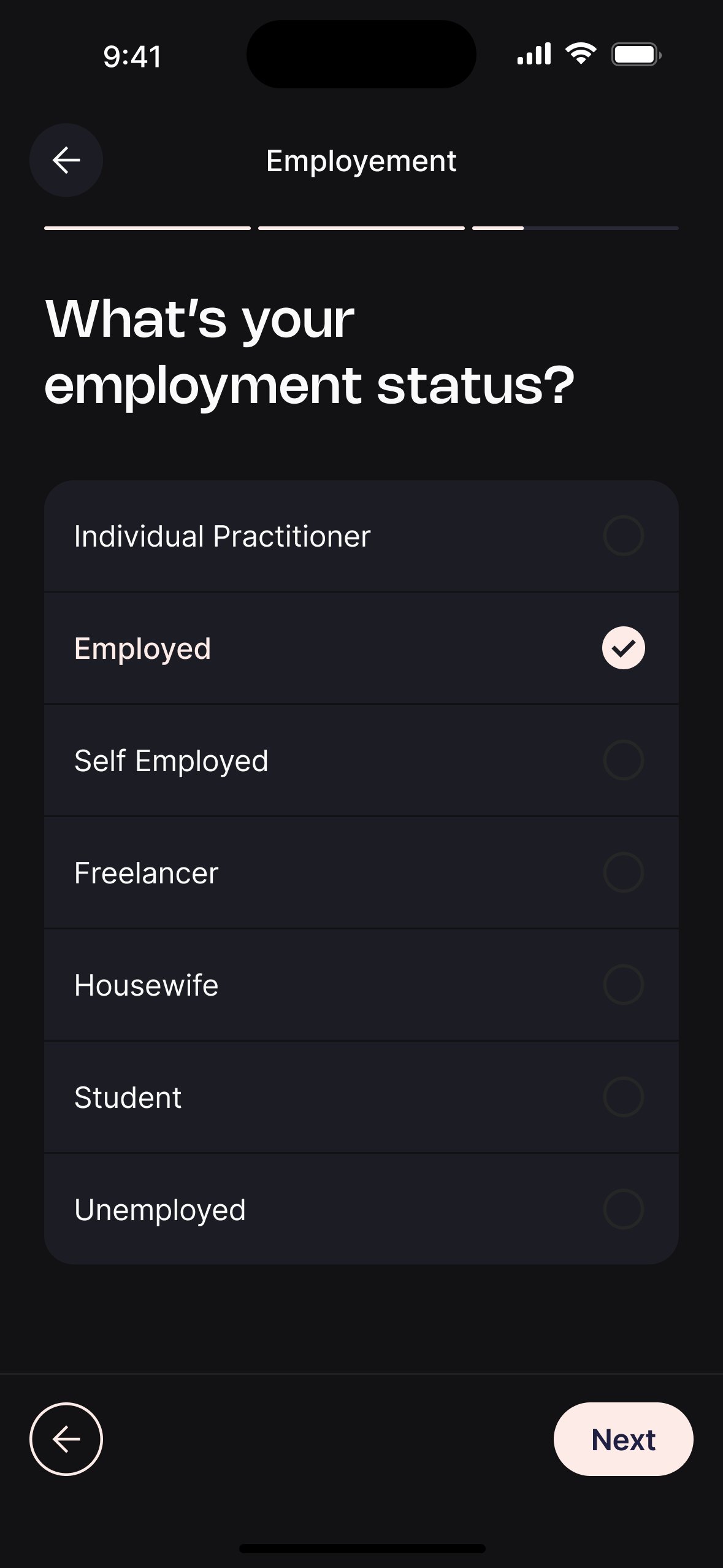
Consumer credit in Egypt spans a wide range of relationships with debt — from the fully-banked professional who sees credit as a convenience tool, to the first-timer who has never held a credit product. The product had to work for all of them without designing to a lowest common denominator.
The employed professional
Salaried, 28–38, smartphone-native. Finds banks slow. Wants fast approval, a clear limit, and QR at point of sale.
The self-employed
Freelancer or business owner, variable income. Has been rejected by banks before. Sees this product as an accessible alternative.
The active borrower
Already approved, uses credit across multiple merchants. Needs clear visibility into what's owed across all loans and when.
The cautious first-timer
22–32, first credit product ever. Anxious. Needs reassurance and transparency woven into every single step.
We didn't open Figma first.
Consumer credit is one of the highest-stakes product categories you can design for. A poorly designed flow doesn't just frustrate users — it erodes financial trust, sometimes permanently. Before a single wireframe was made, we spent weeks understanding the market, the user, and the failure modes of existing products.
Market & competitive research
Audited 6 BNPL and consumer credit products across Egypt and MENA. Mapped entry flows, decision feedback, and LMS patterns.
User interviews & stakeholder sessions
8 user interviews across employment types. 3 stakeholder sessions with PM, risk, and ops to align on constraints and success metrics.
Usability testing & live data
Moderated sessions before launch. Post-launch Amplitude funnel analysis drove two major iterations to the LOS flow and the LMS overview.
The market had a trust problem.
We audited six BNPL and consumer credit products across Egypt and the wider MENA region. The pattern was consistent: technically functional products with UX that treated users as data points, not people.
Eligibility criteria hidden until after full form completion — causing mass abandonment at the decision screen
Rejection messages were blunt and unexplained — "not eligible" with no context or alternative path
LMS experiences were purely transactional — no hierarchy, no proactive guidance, no payment nudges
Most products didn't account for informal employment — forms assumed salaried workers only
Move eligibility check early — let users know they qualify before asking for everything
Design the rejection and semi-rejection states as genuine product moments, not dead ends
Build an LMS with clear visual hierarchy — what's due, what's upcoming, what's available
Use conditional logic to support freelancers, self-employed, and housewives — not just the salaried majority
Eight interviews, one consistent fear.
We ran 8 moderated interviews across four user segments — salaried employees, self-employed, first-time credit applicants, and existing product users. Sessions lasted 45–60 minutes and covered attitudes toward credit, previous application experiences, and reactions to early lo-fi prototypes.
"I didn't know what would happen to my iScore."
7 of 8 users mentioned iScore unprompted. Most believed applying would automatically damage it. This was the single biggest barrier to starting the application — and had nothing to do with the UI.
Design response: Added iScore reassurance messaging at the application entry point.
"The form felt like it would never end."
When shown a linear, step-by-step prototype with no progress indication, 5 of 8 users abandoned during employment information. The form felt arbitrary — they couldn't see how close they were.
Design response: Added a segmented progress bar across all form steps.
"I'm a freelancer — none of the options fit me."
Freelancers and self-employed users felt excluded by employment forms designed for salaried workers. Income documentation, length of service, and company type fields all assumed formal employment.
Design response: Conditional field logic — unemployed/freelancer users see a different, shorter field set.
"I don't know when to pay or how much."
When shown early LMS wireframes, users with multiple active loans couldn't quickly identify what was due. They had to navigate into each loan individually to build a mental picture of their total obligations.
Design response: Consolidated due payments banner surfacing total owed across all loans.
Six products. Six gaps.
We ran a structured audit across the six most relevant BNPL and consumer credit products in Egypt and MENA — scoring each on the dimensions that matter most to a user trying to get credit on their phone. The gaps became our brief.
| Product | Early eligibility check | Instant decision | Freelancer support | Semi-rejection path | LMS overview | Autopay | Early settlement |
|---|---|---|---|---|---|---|---|
Competitor A Egypt · BNPL |
✗ | ✗ | ✗ | ✗ | Partial | ✗ | ✗ |
Competitor B Egypt · BNPL |
✗ | Partial | ✗ | ✗ | ✗ | ✗ | ✗ |
Competitor C UAE/KSA · BNPL |
✓ | ✓ | Partial | ✗ | ✓ | ✓ | ✗ |
Competitor D KSA/MENA · BNPL |
✓ | ✓ | ✗ | ✗ | ✓ | ✓ | Partial |
Competitor E Egypt · Consumer credit |
✗ | Partial | ✗ | ✗ | Partial | Partial | ✓ |
Competitor F Egypt · Consumer finance |
✗ | ✗ | ✗ | ✗ | ✗ | ✗ | Partial |
Our Product Egypt · BNPL + Credit |
✓ | ✓ | ✓ | ✓ | ✓ | ✓ | ✓ |
Our product is the only one in the Egyptian market with all eight features. The two nearest competitors are not Egypt-native and don't fully serve the informal employment segment — which represents a significant share of Egypt's working population.
From research to design questions.
After synthesising interviews and the competitive audit, we ran a How Might We session with PM, risk, and ops to translate raw insights into actionable design questions. These became the guiding constraints for every subsequent design decision.
How might we build enough trust in the first screen that users feel safe providing their national ID data?
How might we design a form that collects financial data without feeling like an interrogation?
How might we turn a rejection into a moment of dignity rather than shame — and still capture users in a grey zone?
How might we surface the right payment information at the right moment — without overwhelming users who have multiple active loans?
How might we drive autopay adoption without making users feel they're giving up control of their money?
The first version taught us everything.
V1 shipped with a linear 10-step application and a basic LMS overview. Post-launch Amplitude data and a second round of usability testing revealed two critical failure patterns. V2 addressed both.
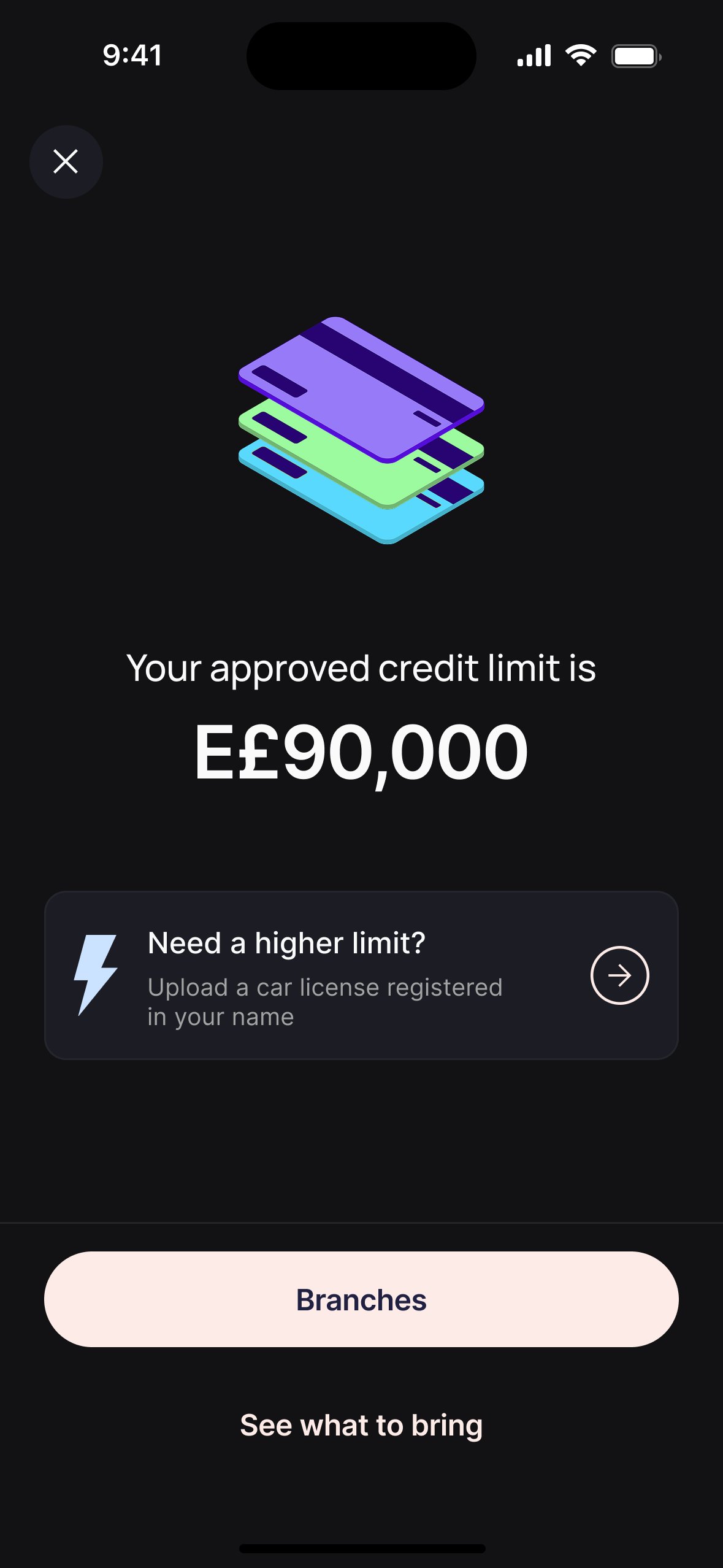
Eligibility at the end
Users completed the full 10-step form before finding out if they qualified. Amplitude showed a 39% drop at the decision screen — the highest single drop-off point in the entire funnel.
Eligibility at step 2
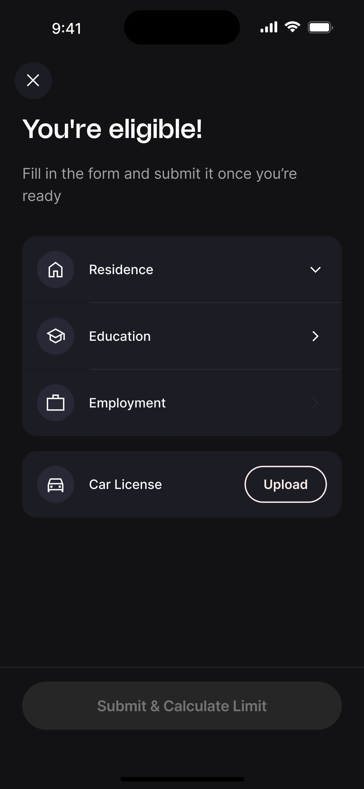
Moved the check immediately after NID. Users who pass see "You're eligible!" before a single form field. Users who don't pass exit cleanly at step 2 — without wasting time or feeling deceived.
Flat loan list
The overview was a flat list of loans with no payment summary. Users with 3+ active loans couldn't quickly understand their total obligations. Autopay was buried in settings — 3% adoption.
Structured overview + inline autopay
Three-section overview: available credit, consolidated due payments, then loans list. Autopay surfaced as a quick insight card labelled "Avoid late payments" directly under the due banner.
What testing actually changed.
We ran two rounds of usability testing — 5 moderated sessions before launch on a high-fidelity Figma prototype, and 4 unmoderated remote sessions after V1 shipped. Both rounds produced actionable findings that directly changed what was built.
Users confused "Available Credit" with their bank balance — expected it to be money they could withdraw
High — caused incorrect mental model of the product
Added "use it to buy from merchants" descriptor. Renamed internal label. Added Buy Now CTA directly under the credit balance.
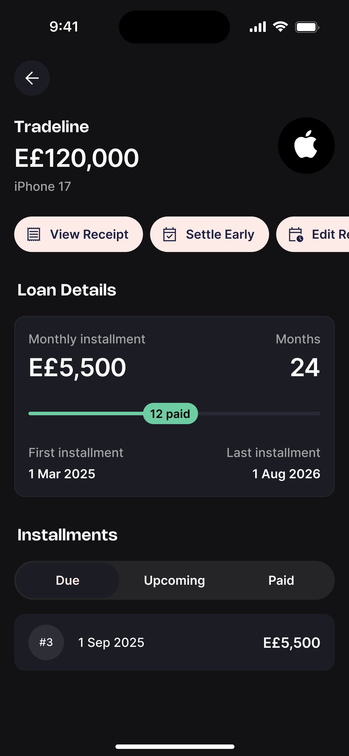
The "1/12" installment counter on loan cards was misread — users thought it meant 1 out of 12 payments remaining, not paid
Medium — caused anxiety about payment status
Added "paid" label to the counter. Changed visual treatment to show progress bar within the loan card.
In testing, 4 of 5 users didn't explore the employment form for freelancers — assumed it wouldn't apply to them and nearly dropped off
High for freelancer segment — direct abandonment risk
Made "Freelancer" a prominent option in the employment type list. Simplified the subsequent freelancer-specific fields significantly.
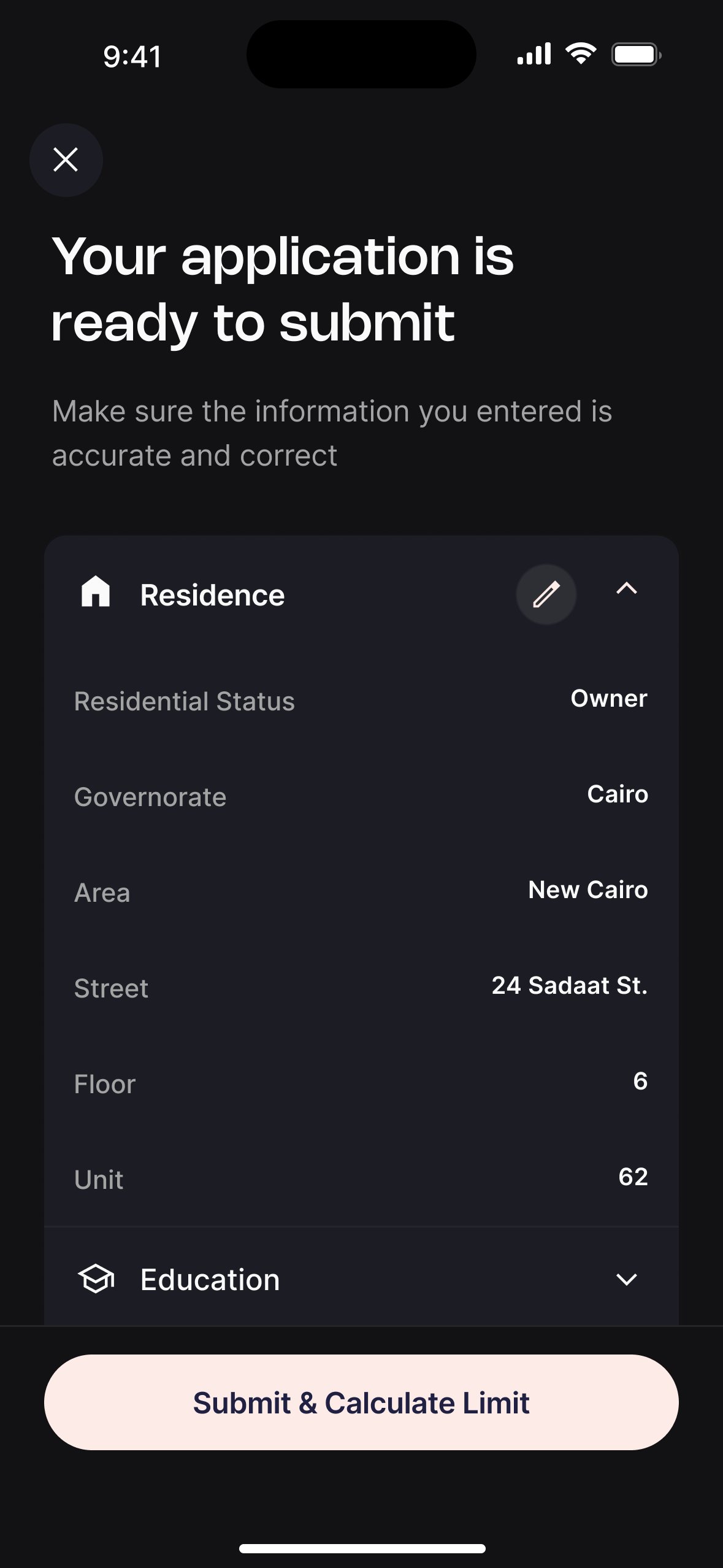
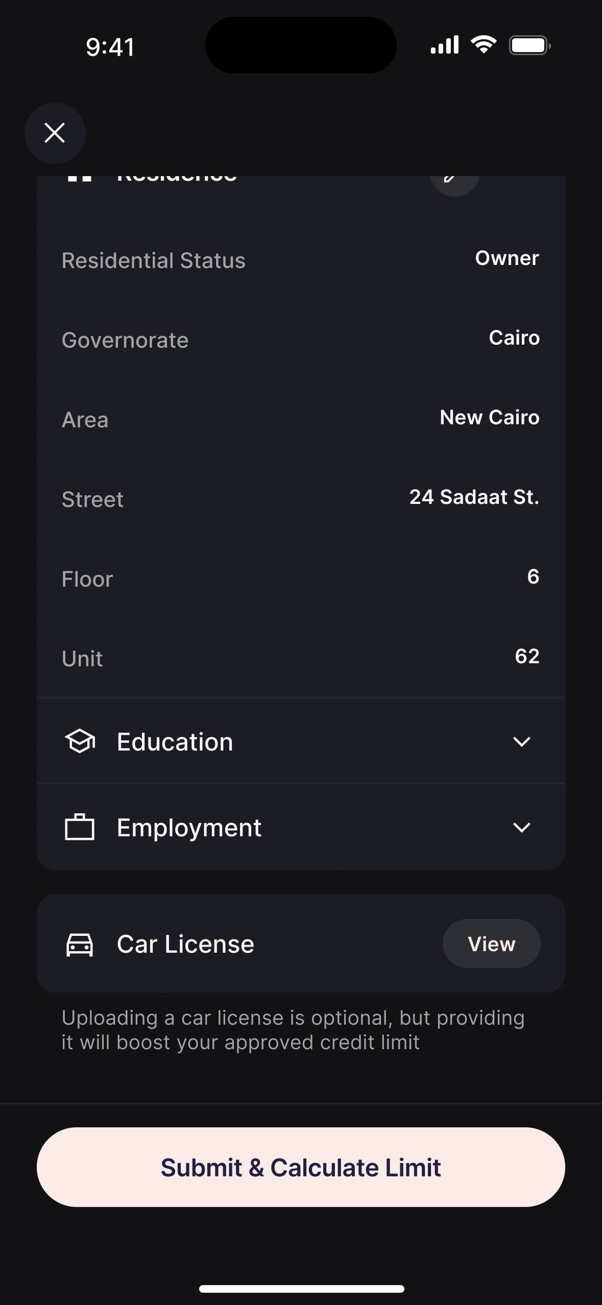
The Application Form.
How a user goes from discovering the product on the home screen to receiving an approved credit limit — in minutes, entirely on mobile.
From home screen to approved limit.
The application collects national ID data, runs an eligibility check, then gathers residential, employment, education, and vehicle information before submitting to the decision engine. Every step was designed to reduce friction while meeting the data requirements of the credit model.
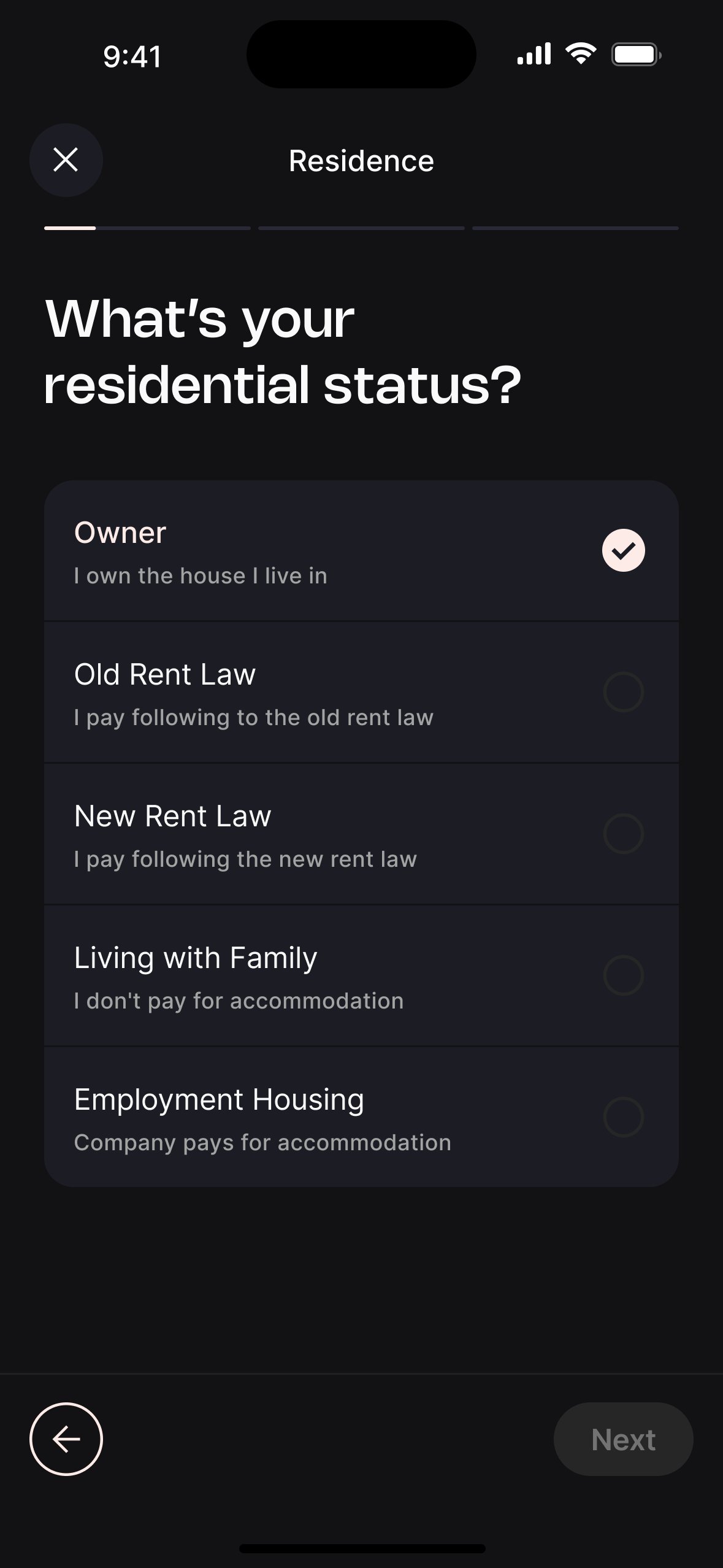
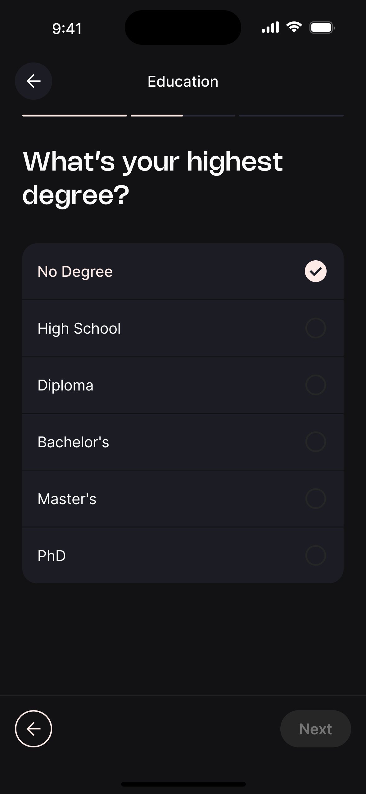

Eligibility check before the long form.
Originally the iScore and fraud check ran at the end. Users who would be rejected were filling in 8 screens of personal data before finding out.
Moved the check to immediately after OCR. Rejected users exit at step 2, not step 8 — reducing wasted effort and signalling respect for their time.
Semi-rejection as a product, not a dead end.
Binary approve/reject lost users in the grey zone — not eligible for the standard product, but not a hard rejection either.
Designed a semi-rejected state routing users to a specific program with modified terms. 22% of decisions are semi-rejections — all of them now have a path forward.
Loan Management.
How approved users live with their credit day to day — managing multiple loans, tracking installments, paying on time, and settling early.
One hub, every journey.
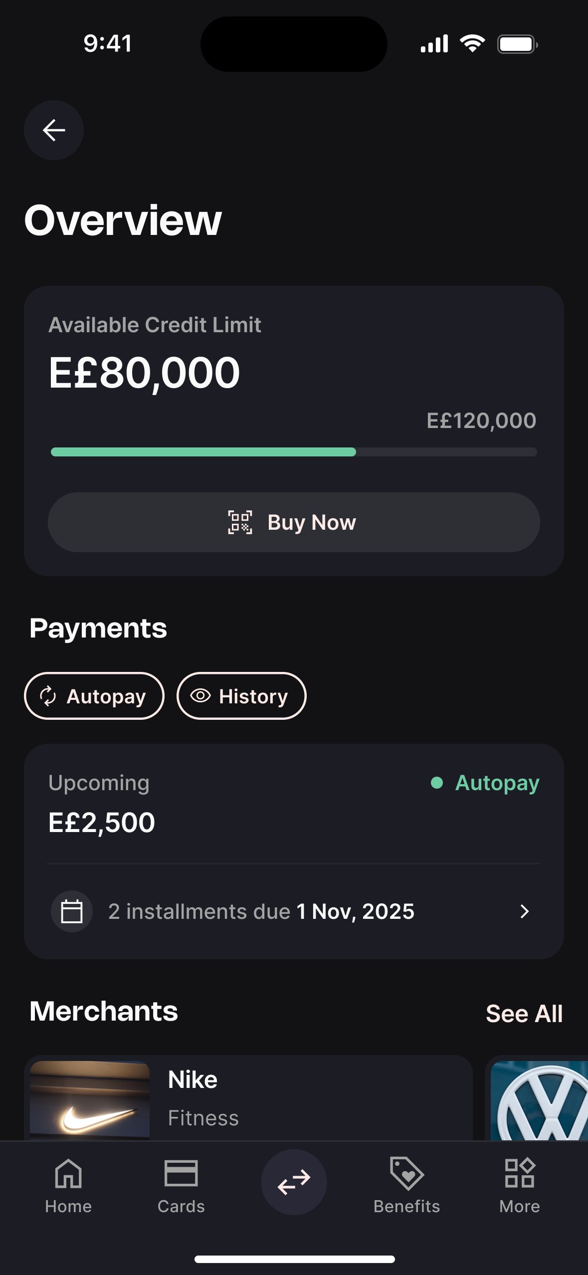
The LMS was designed around a single overview screen that gives users everything they need at a glance — available credit, upcoming dues, and all active loans — with clear paths into every action from there.
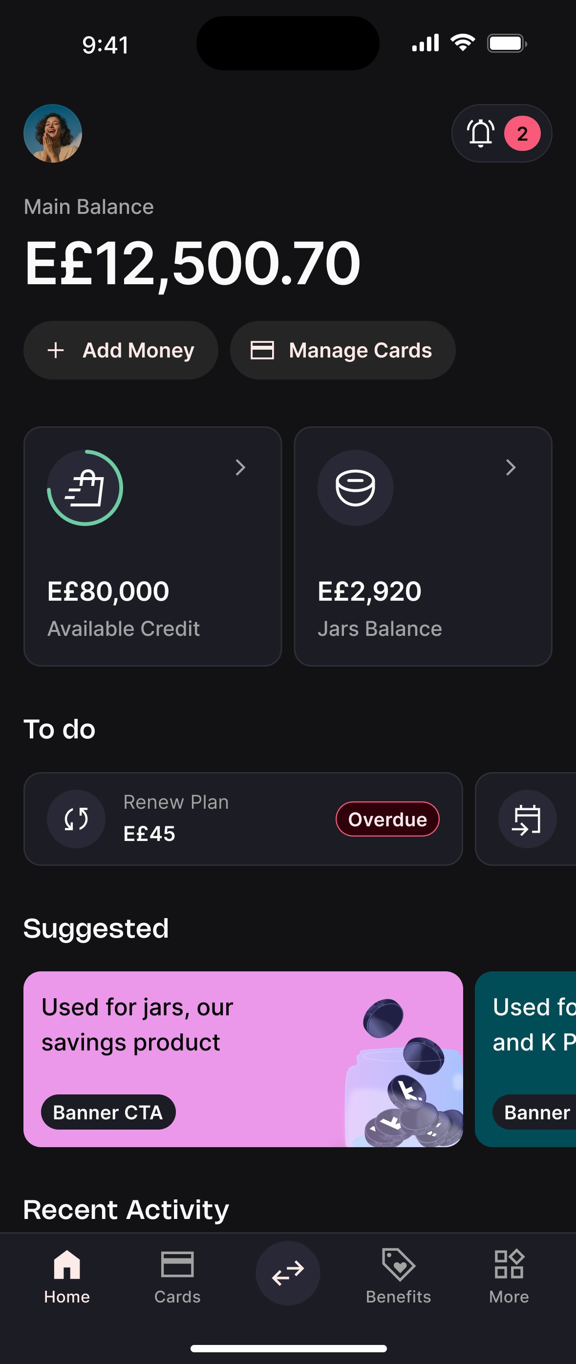
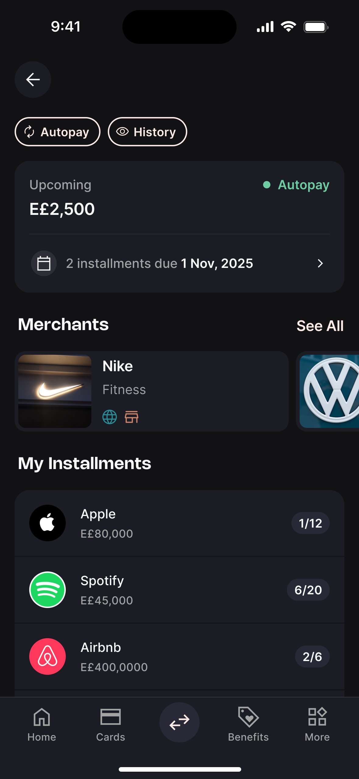
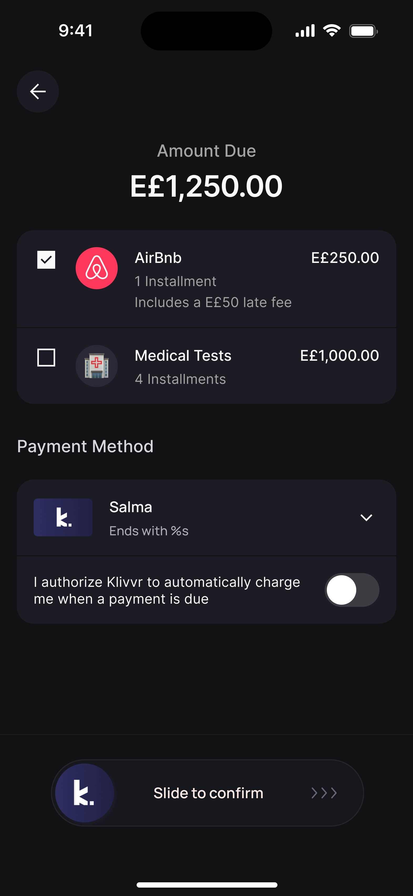
Due payments always above the fold.
The overview had to show available credit, due payments, and a full loans list. Without clear hierarchy, the most time-sensitive information risked getting buried.
Due payments became the primary element when loans are active. Every other navigation decision was subordinated to this — missing a payment was the most damaging thing that could happen.
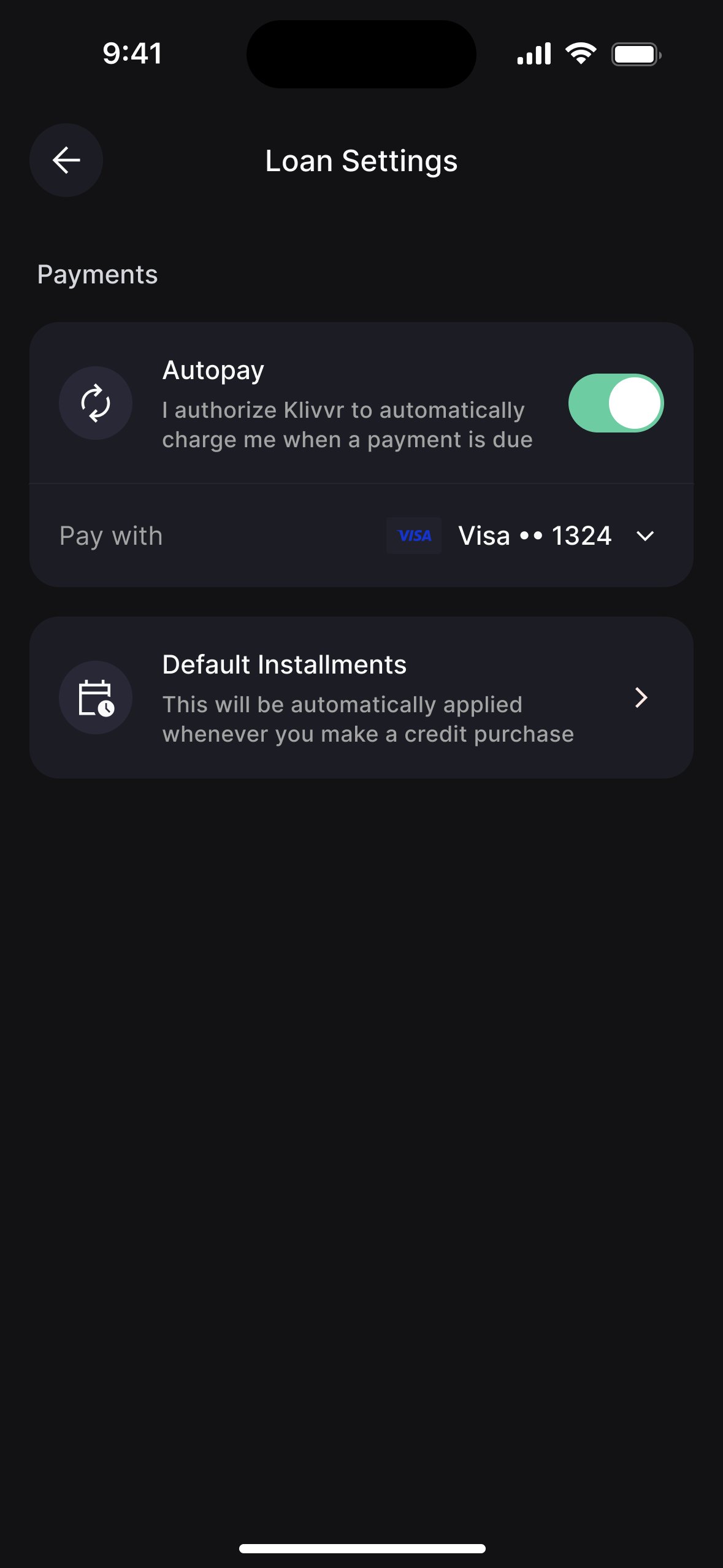
Autopay as a proactive insight, not a buried setting.
Autopay was only accessible through settings. Most users never found it — and a missed payment was the most damaging outcome for both the user and repayment metrics.
Added autopay as a quick insight card labelled "Avoid late payments" — framed around user benefit. Result: 46% adoption, versus near-zero from settings alone.
On state design as the real work.
The happy path is easy. A lending product has more edge states than almost any other product type — no loans, one overdue loan, multiple loans in different stages, a closed limit. I spent more time on state design than screen design. That's what keeps the product coherent when real users arrive with real messiness.
On building without a benchmark.
No prior version, no existing pattern library for financial flows. Every decision left a trace — the patterns I built are now the baseline for every lending feature that ships after me.
On the 46% autopay number.
Moving autopay from settings to a proactive insight card was a small design decision with a disproportionate impact. It's a reminder that placement is content.